Introduction
Ardley gives people a simpler way to get a mortgage and puts them in control so they know they’re getting the best deal. This project focused on UX research, developing labeling for simplicity, and building the trustworthiness of the brand.
Methods Used: User Testing/Interviews, Card Sorts, User Personas
Research Approach
Project Overview
The goal of this research project is to gain a better understanding of what users are looking for as they get a mortgage, what they currently like about Ardley’s site, and how it can be improved.
Research Method
To accomplish this, I will initially interview 2 people, ages 21 and 22, about their impressions on the Ardley website. The session will take anywhere from 20 to 30 minutes total. Interviews will be recorded.
Findings and Recommendations
The interviewees liked the current look of the site and felt it had good colors that gave off a nice vibe, but wasn’t too bright and overwhelming. One subject, however, was very confused as to what the website was about based on initial impressions. Her initial thought was it was about “making your home homier,” only to later see the word “mortgage” in small letters, blending into the images on the homepage. Another subject believed that it looked like every other startup site with a long scrolling homepage and thinks there should be more tabs up top to help visitors to browse easier.
They each identified the target market which the Client and I originally discussed as millennials or late 20s to early 30s based on the fact that that’s who may be most likely to be looking for a mortgage. It was also mentioned that women may be more likely to use this site because “women are more responsible,” in other words, more likely to search for the best deal, as well as the fact that all the pictures of people are women and the site overall lacks a manly feel. They also discussed that a non-tech-savvy person may struggle to navigate the site as there isn’t a ton of “informational stuff” and subject #2 felt that she “didn’t know where to start.”
When asked to locate where to go to actually sign up for a mortgage there was some confusion. There is nowhere on the actual website to sign up for a mortgage. When subject #1 learned this, she described the site as “pointless” and said there’s no reason to go to the site if they’re just going to direct you to an app. When subject #2 learned she had to go through an app, she expressed disinterest as normally an app is “more for something on the fly, not for a serious decision [like getting a mortgage.]” Originally the site was seen as trustworthy, however after realizing that there was nothing to do on the site other than get a consultation, it was deemed untrustworthy, and the subjects would rather just go through a bank.
Learned During Initial Research
User Interviews
- UI is confusing -- People don’t really know what to do on the site.
- Without being able to sign up for the service, the website seems untrustworthy.
Card Sort
- Helped to determine UI labeling
User Persona
Courtney and Brad (25) are newlyweds looking for their first home together. Courtney is a hairdresser and Brad is an accountant. They found their dream home, but need a mortgage in order to afford it. They don’t really trust their bank to give them the best deal, but they need to find the right mortgage for them as fast as possible. They’re looking to start a family soon and want to be all settled into their new home before bringing a child into the mix. Being busy people, Courtney and Brad want to find a service that’s not too confusing since they’ve never done this before and gives them the best deal.
Goals
- Move into their dream home and not have to worry about coming up with the money.
- Get ready to start their own family.
Background/Pain Points
- Courtney and Brad have been married for 3 months.
- They both prefer to do things on their computers, rather than on phones.
- Worries they’ll be taken advantage of if they just go directly to a bank.
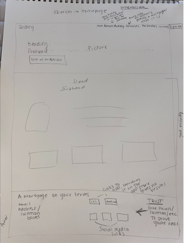
Design Tenets
Trust:
- Users want to feel like you’re going to take care of them. If they trusted a bank, they’d go there, but because the reason they’re coming to Ardley is lack of trust in banks, you need to give them an experience they trust.
Informational:
- With such a big decision as getting a mortgage, the customer wants to know all the information up front. They should know exactly what the site is about and what they need to know to get started in the first few seconds of looking at the page.
Organized and Simplistic:
- Getting a mortgage isn’t something people do often. When they come to the site, we need them to feel comfortable and be able to go through the process without stress or confusion, regardless of the last time they went through the process.
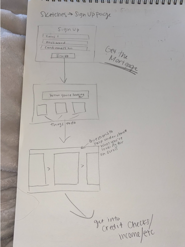
Get the Mortgage:
- Currently, there’s nowhere on the website that you can actually sign up and get a mortgage. Based on feedback from my interviews, for such a large decision, users would prefer this process on the website rather than, or in addition to, the app.
Changed Based On Initial Research
- Added the option to actually sign up and get a mortgage
- Improved UI labeling
- Added footer with social media links, links to app (once that’s fully ready), and more contact/location information to build trust
Sketches


Mockup
Conclusion
- The main goal of Ardley is to make the mortgage process as simple as possible for the user who has never gotten a mortgage before.
- My project focused on using UI research to label the site in the most straightforward and easily understood way possible.
- I also worked to increase the trustworthiness of the site (a problem starting off) through the addition of the footer, as well as adding the ability to sign up directly from the site, giving it a purpose.