My focus
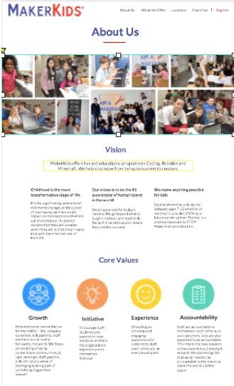
My personal focus throughout the design phase of this project were the "About Us" and "In the Press" pages.
Link to final prototype: https://lthrzy.axshare.com
Project Overview
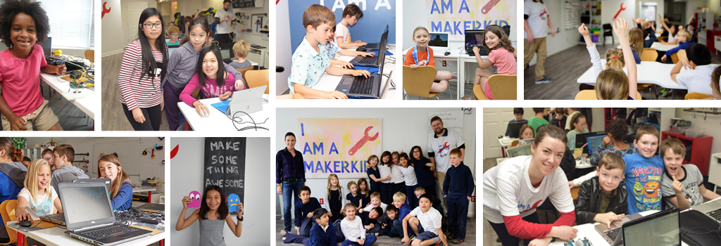
At the beginning of the semester, we were divided into groups and assigned to work with a client to evaluate their existing interface and to design a high fidelity prototype. My group was assigned to a children's Coding, Minecraft, and Robotics camp called MakerKids.
After a meeting with the client, we decided that our main goals for the site were to improve the navigation, maintain consistency between pages, give each page a specific purpose, and create a sense of authenticity on the site to encourage parents to sign their children up for camps.
From the beginning, we new our greatest challenge would be condensing the information on the site to be less overwhelming, while still providing the information needed and making sure it was organized in a way that was aesthetically pleasing and easy to read.
Phase 1: The Discovery Phase
Throughout this phase, the research methods we used were heuristic analyses, contextual interviews, persona development, competitive analyses, and usability tests using eye tracking.
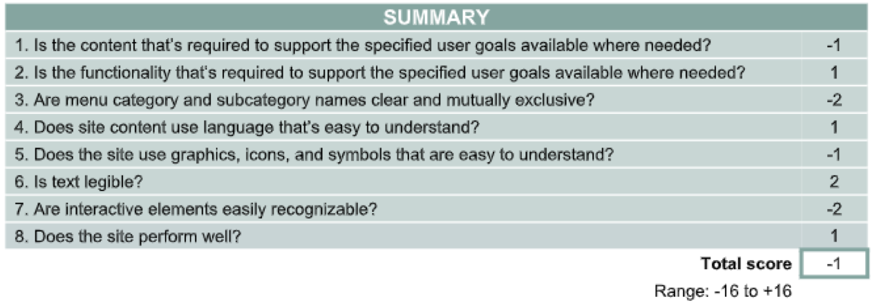
Heuristic Analysis
This process discovers how the original site scored based on the goals we had for the MakerKids site. This gave our team a detailed overview of what we needed to focus on for our redesign. This showed us that there was major room for improvement of organization, overall design of website, and the terminology used.
Contextual Interviews
We interviewed five women ages 33-46, with children ages 5-18. Some general trends we discovered during these interviews were that a professional layout was preferred and increased the authenticity of a site and an easier registration process makes a parent more willing to sign their child up for camp. Many of the mothers also stated that they sign their children up for camps to keep them occupied during breaks.
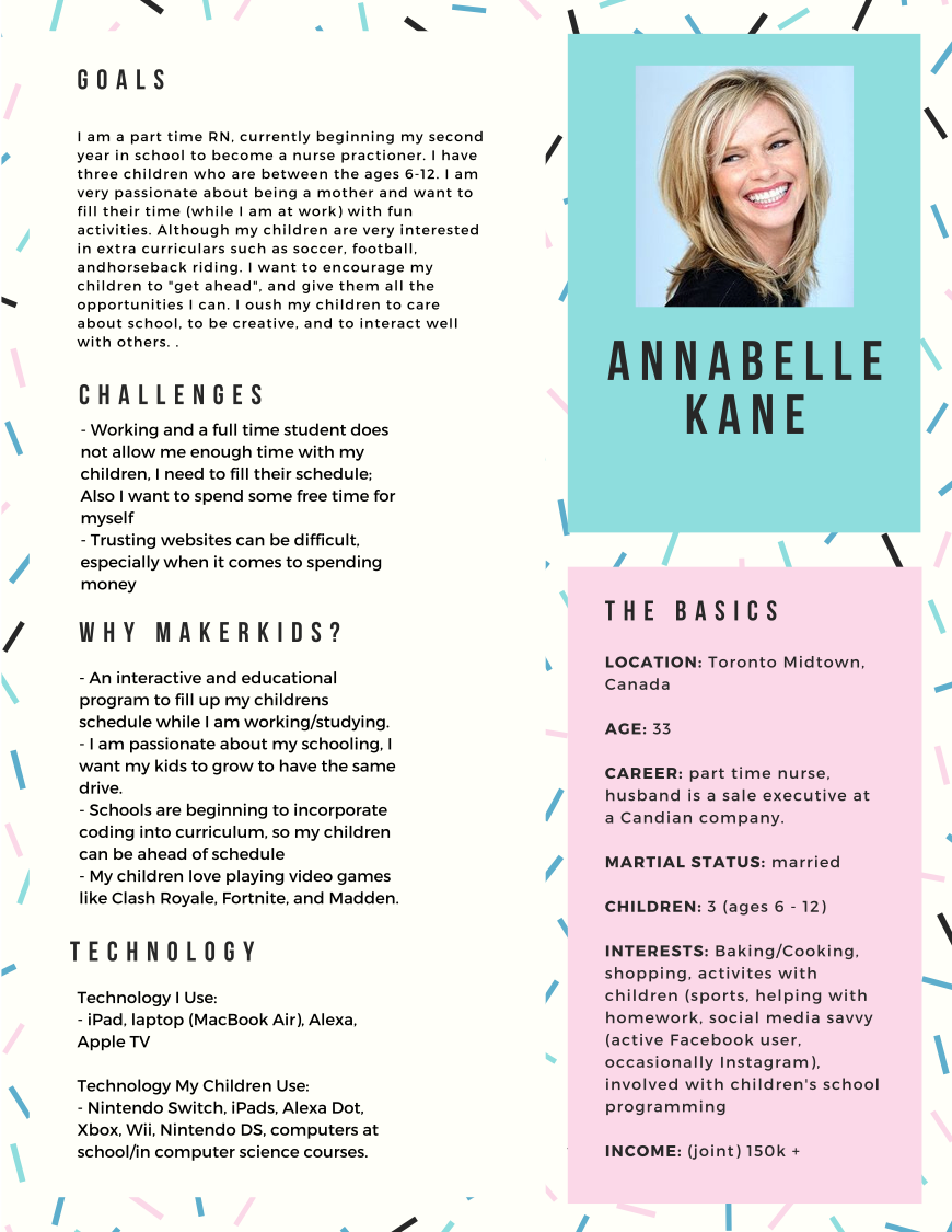
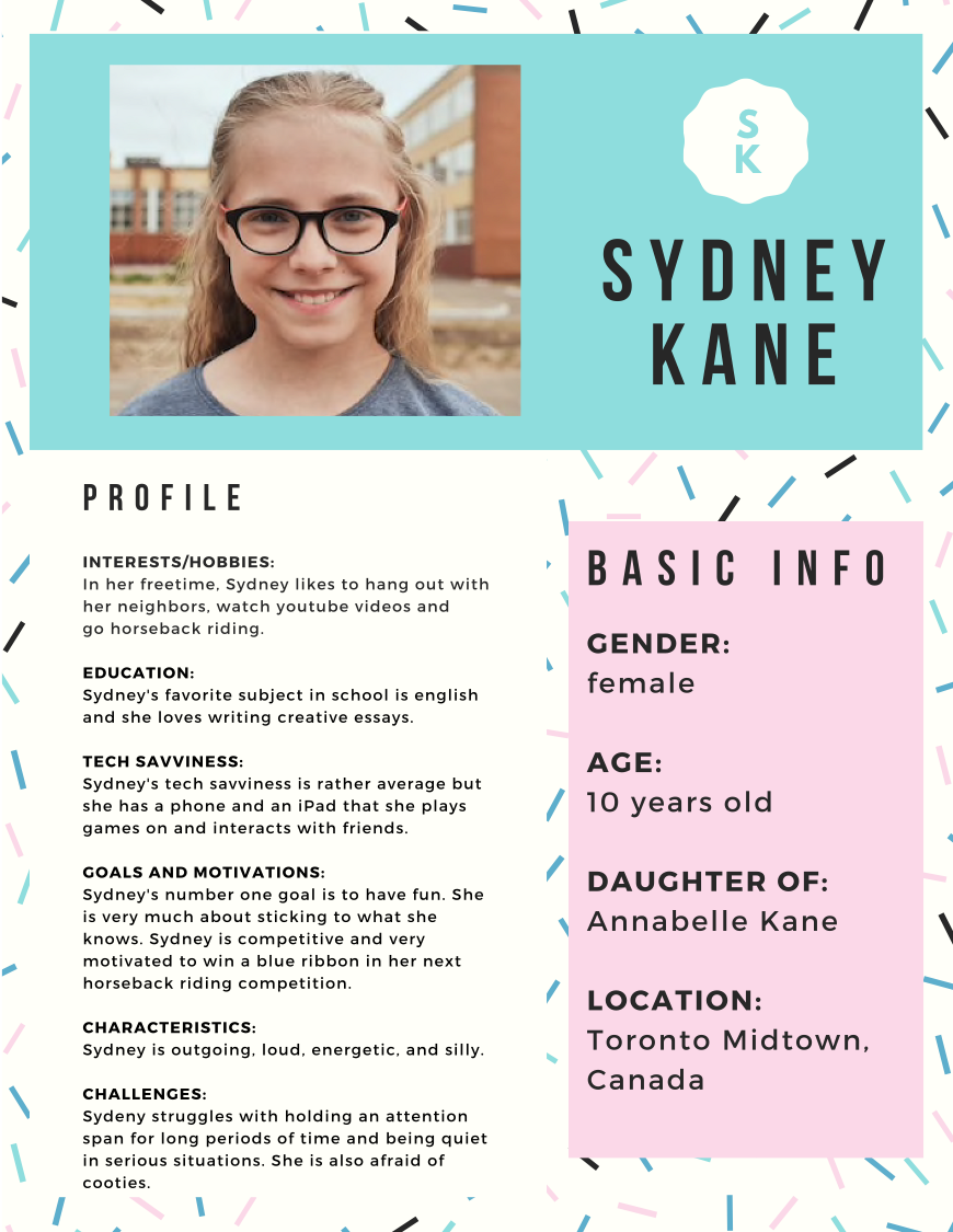
Persona Development
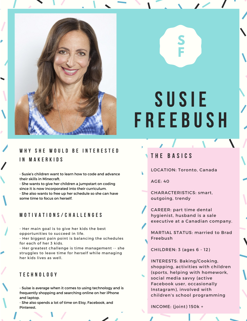
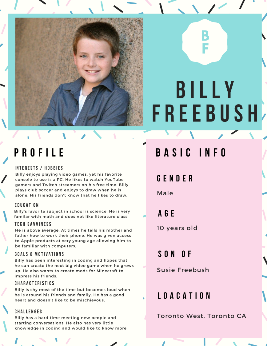
After conducting contextual interviews, we created four personas based on our findings. Annabelle and Sydney Kane are a mother daughter duo in which the parent wants to sign her daughter up for a camp but she is not interested.
Susie and Billy Freebush are the opposite of Annabelle and Sydney. In this set of personas, Billy found the camp online and asked his mother to sign him up. I personally created the persona of Susie Freebush.
Competitive Analysis
We reviewed MakerKids main competitors to identify where the site needs to be improved in order to compete. The companies we analyzed were ID Tech, Code Ninjas, Codeverse, BitsBox, and Tynker.
Some key takeaways were that Makerkids' competitors sites seemed more trustworthy, had a simpler registration process and navigation bar, used terminology that was easier to understand, and let the viewer know exactly what the goal of the site was on first impression.
Usability Tests
Conducting usability tests helped our group to identify issues with user experience, terminology, and navigation. During these tests, we used an eye tracker to be able to see exactly where each person was looking during the different tasks. The usability test was by far our biggest indication on which sections of the original site needed improvement. The participants for this test were two Miami students, one Miami staff member, and two professors -- all with a high comfort level of technology.
From these tests, some of the problems we found were that when registering, you are taken to an external page, there was a lack of consistency between pages, and many viewers didn't understand the specific purpose of each page. The site also was extremely cluttered and difficult to navigate, the terminology used was confusing and inconsistent, the site seemed untrustworthy, and the most important things on each page weren't being prioritized.
Phase 2: The Defining Phase
In this phase, we began to focus on design elements based on the research we conducted in the discovery phase. All of the design elements we adjusted or created on the website were backed by our research. These findings completely influenced our mockups, wireframes, and high fidelity prototype. We then ran user testing on our completed prototype to ensure the prototype was effective.
The design methods we used in this phase were user flows & storyboards and ideation & wireframes.
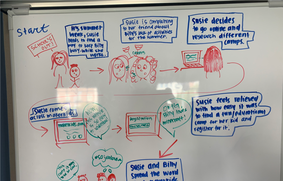
User Flows & Storyboards
Here, the story was about the process of entering the MakerKids website and checking out a program for a child (using the personas we previously created).
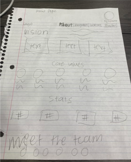
Ideation & Wireframes
We created a series various mockups to ensure the website carried a consistent rhythm throughout, while avoiding any repetition. After creating solid mockups that incorporated the solutions found based on our data, we were able to move forward in creating the wireframes, then the prototype.
Phase 3: The Design Phase
In this phase, we combed through all of the research that we conducted for our final product, added graphic design elements that our research suggested, and began to compile our research in order to present our overall conclusion and recommendations.
Based on our findings, we decided the main issues with the original site that we needed to fix were: clearly defining the goal of the website on the homepage, improving the legitimacy of the site, keeping each page consistent with the rest, improving organization and using universal terminology, and better prioritizing the most important features of the site.